prsnt: A tale of pivoting
Introduction
Rare is the case when designers get to join a venture in which they have absolute influence over the direction a product or a company, is going. We join teams in which we have to quickly convert to evangelists and take ownership of the product.
My team actually started out with a totally different software application with the goal of completely revolutionizing how the architectural and construction industry handled their product knowledge management. This initiative was backed by decades of knowledge and expertise in the design and construction industry of its co-founders.
With a product already in the market and looking to gain more traction, the team decided to go back to the drawing board, conduct more user research and test assumptions.
After two months of talking with our target audience and understanding their pain points, research revealed that their need wasn’t just focused on categorizing products, but in sharing that information with clients and teammates.
Research about this user base:
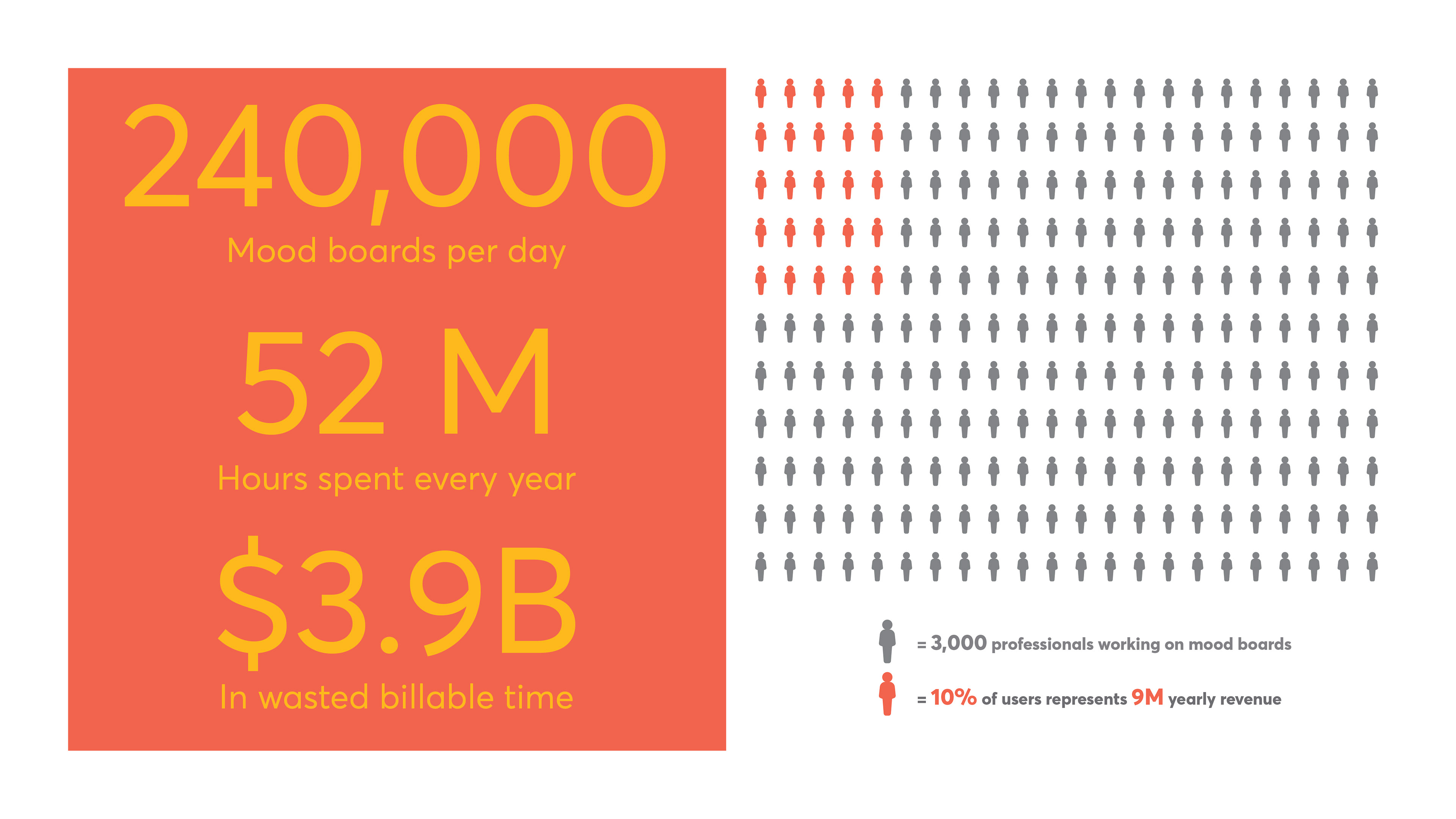
- 109,748 registered Architects in the US. Five times that amount of non registered.
- 224,548 Interior Designers and Decorators
- 116,700 Event Planners
- 18,940 Fashion Designers
- Total Addressable Market = +500,000 users
We took a good amount of time to first establish our narrative around simplicity being our driving force. We're always looking through that narrative when thinking about implementing or changing a new feature.
UX Team of One
Being in a situation where you are the key person driving a user-centered design practice in your company involves positives and challenges. You feel like a jack of all trades, master of none. You need to become the cheerleader for your users. You are constantly learning new things on the job. You are charting your own course. One of the first things I thought important to do was to come up with a diagnostic of the current state of the platform and action plan of which activities to perform.
To summarize our learnings during this initial diagnosis we:
- Performed a User Experience Questionnaire
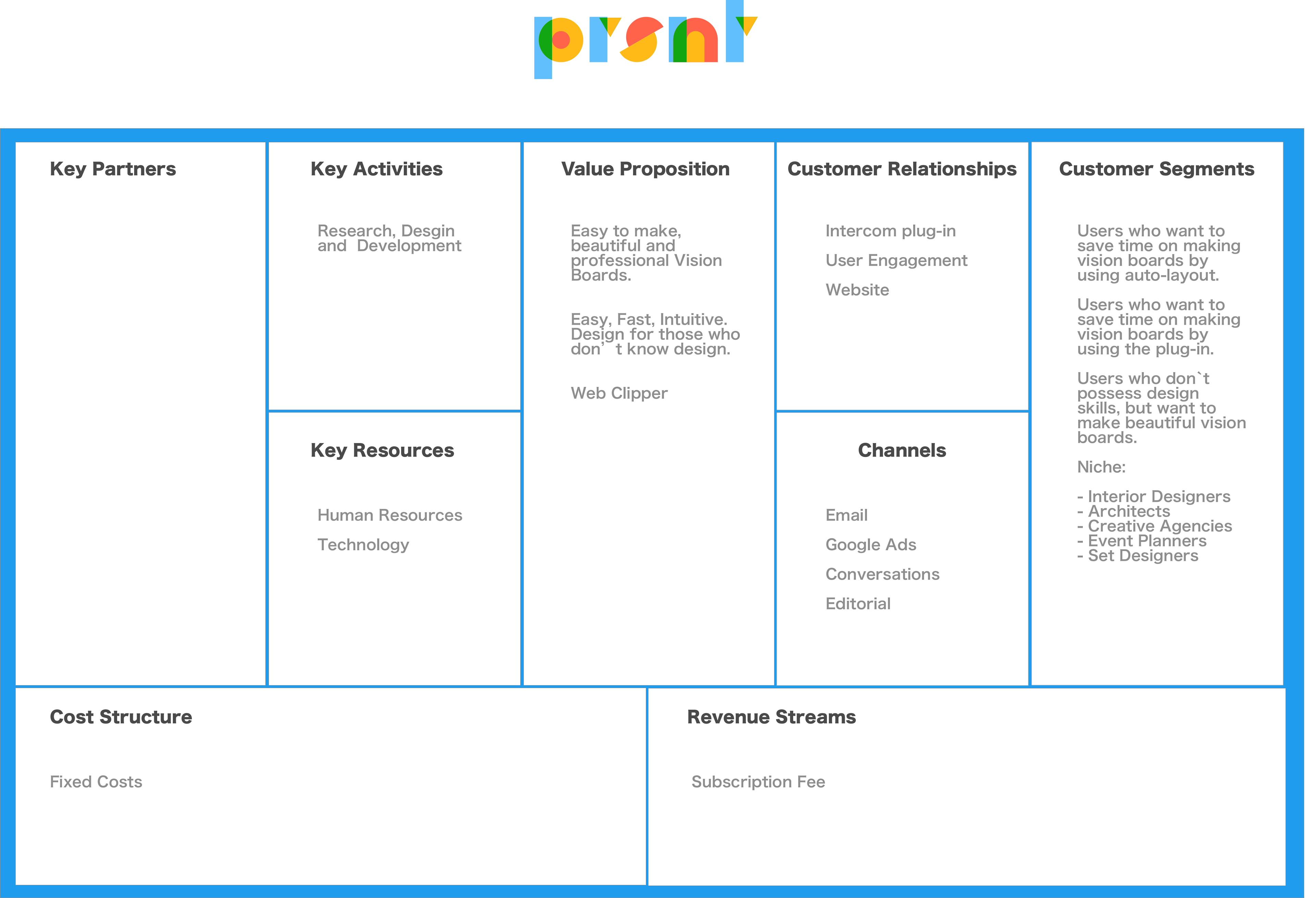
- Created a Business Model Canvas
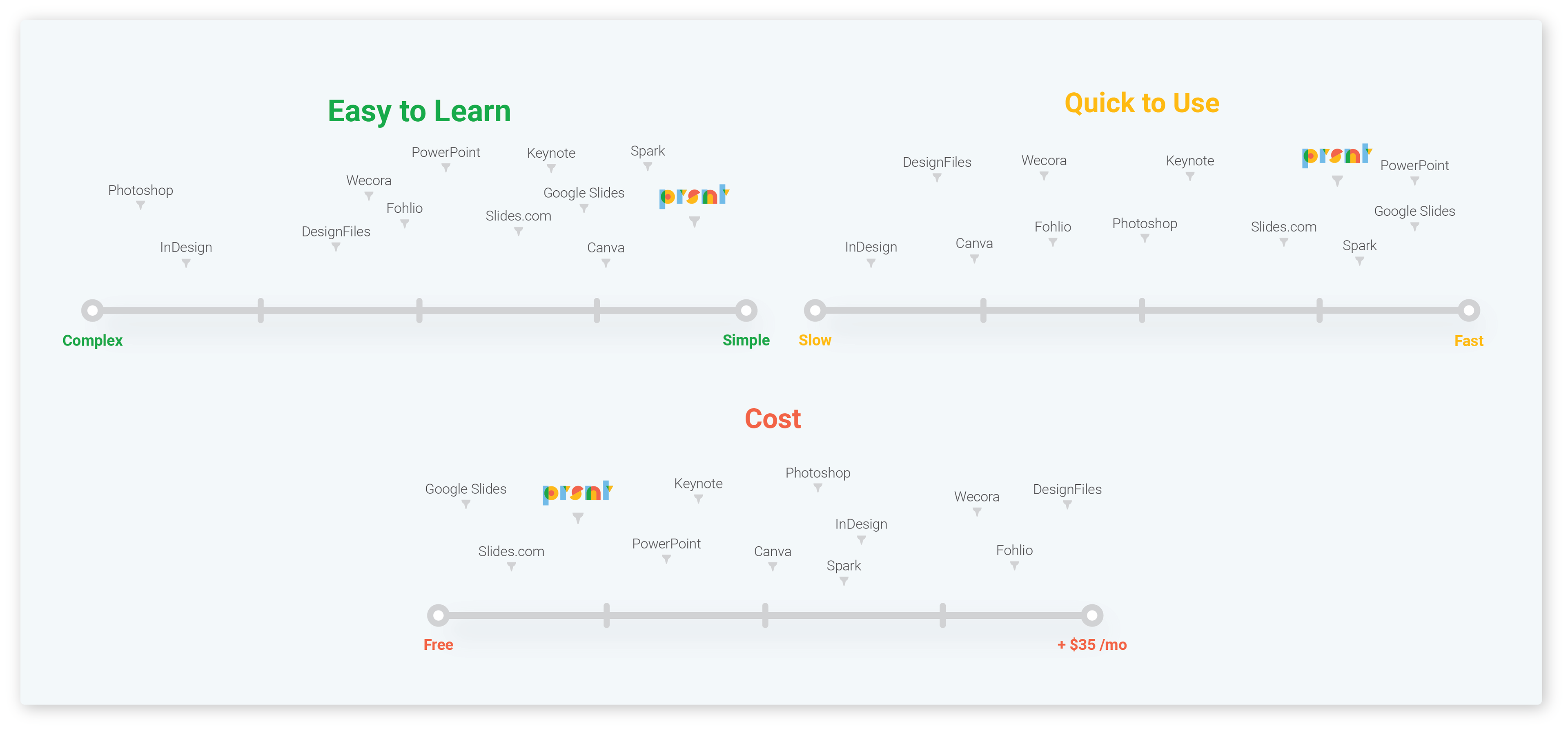
- Completed a Competitive Landscape Analysis
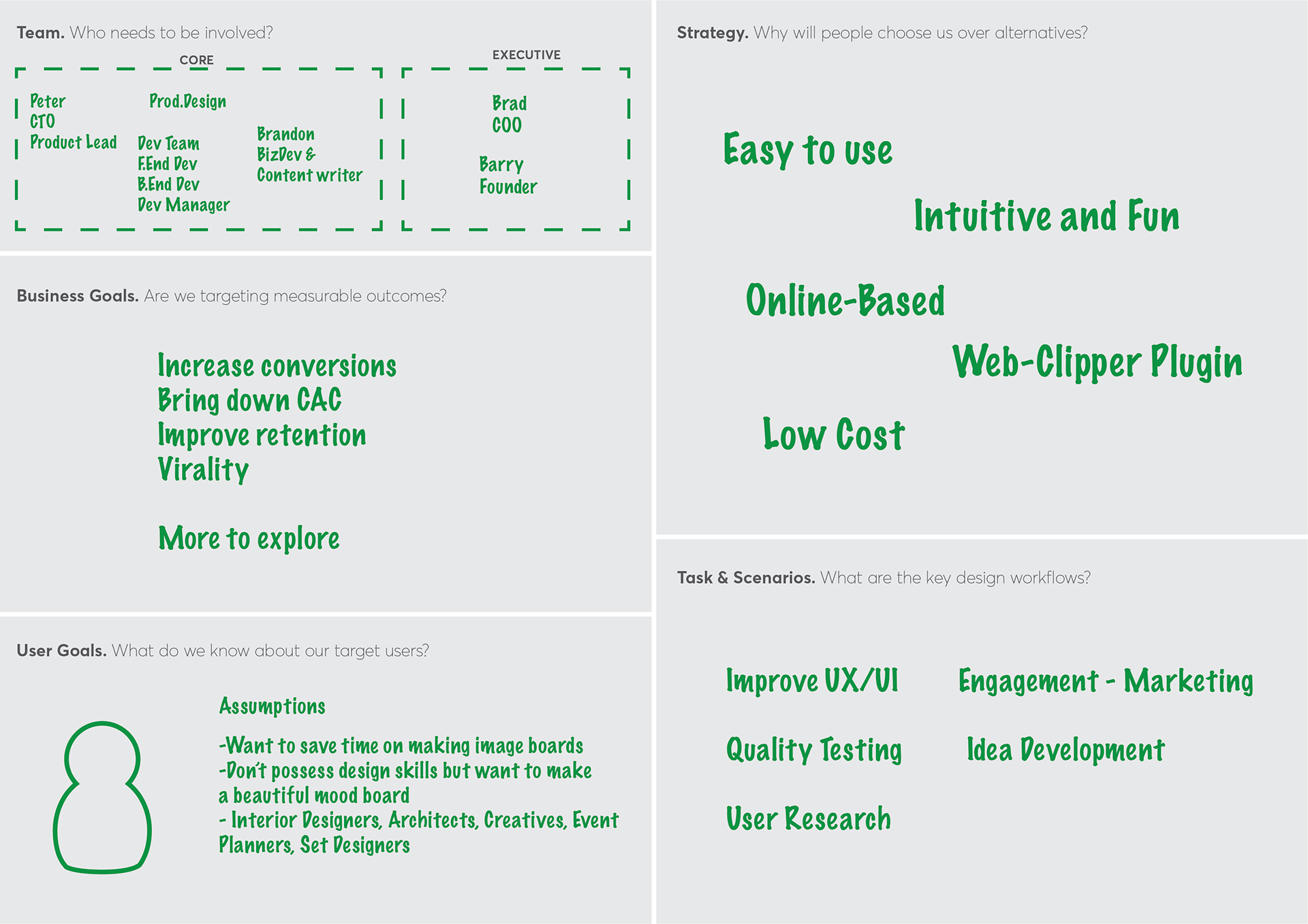
Next step was to come up with an action plan and direction by making a project brief.
- Top 3 Business Needs
- top 3 User Needs
- Features and Functionality to be modified or added
Business Needs
Ramp up paid conversions. Increase traffic on website. Reach target market.
User Needs
Improve usability. Align UX with target market needs. Lock engagement.
Improvements & New Features
Pricing page. Onboarding improvements. Categorizing images. Cleaning the UX and Toolbar. Organizing the tool menu order. Organizing the account settings.
The Work
Conducting Research
In order to test our assumptions about product and market fit. We conducted research in the form of surveys and dozens of qualitative 1-on-1 conversations with our target audience.
Sketching, Wireframing, Testing, Deploying
Working in an agile environment can have its own challenges, with tight short deadlines. But it guarantees an efficient workflow. Progress is easier to measure and running a nimble operation allows for quick response to changes taking place in our ideas and technology. The most important benefit is the quick feedback loop from users that it provides.
Pricing Page
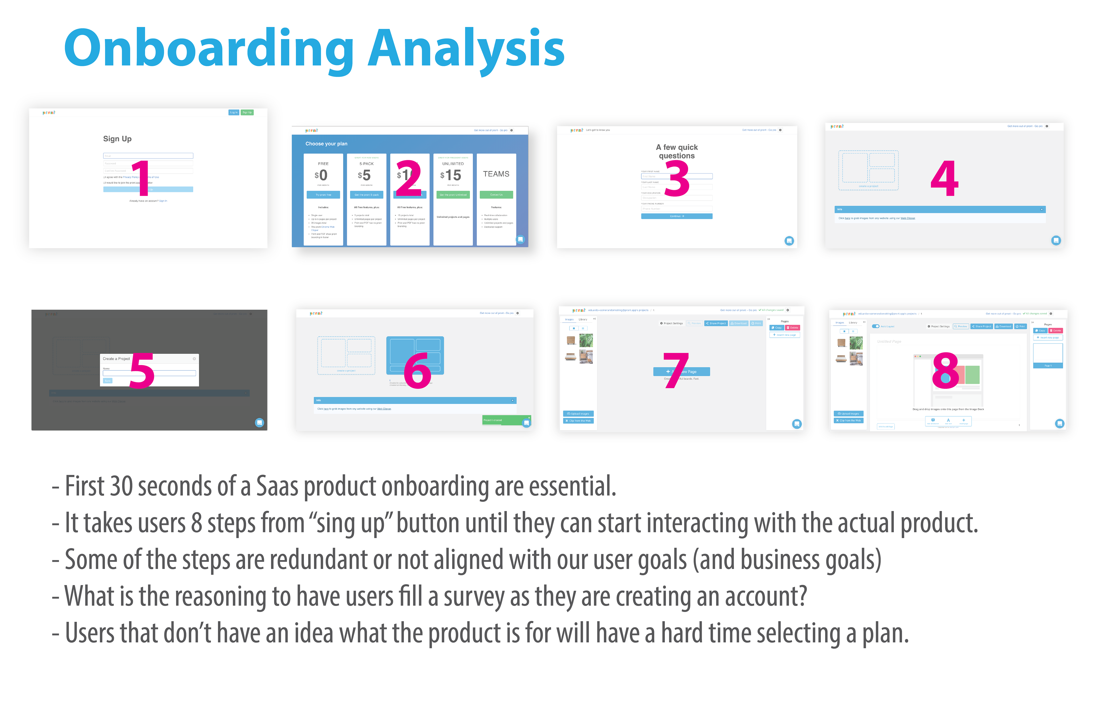
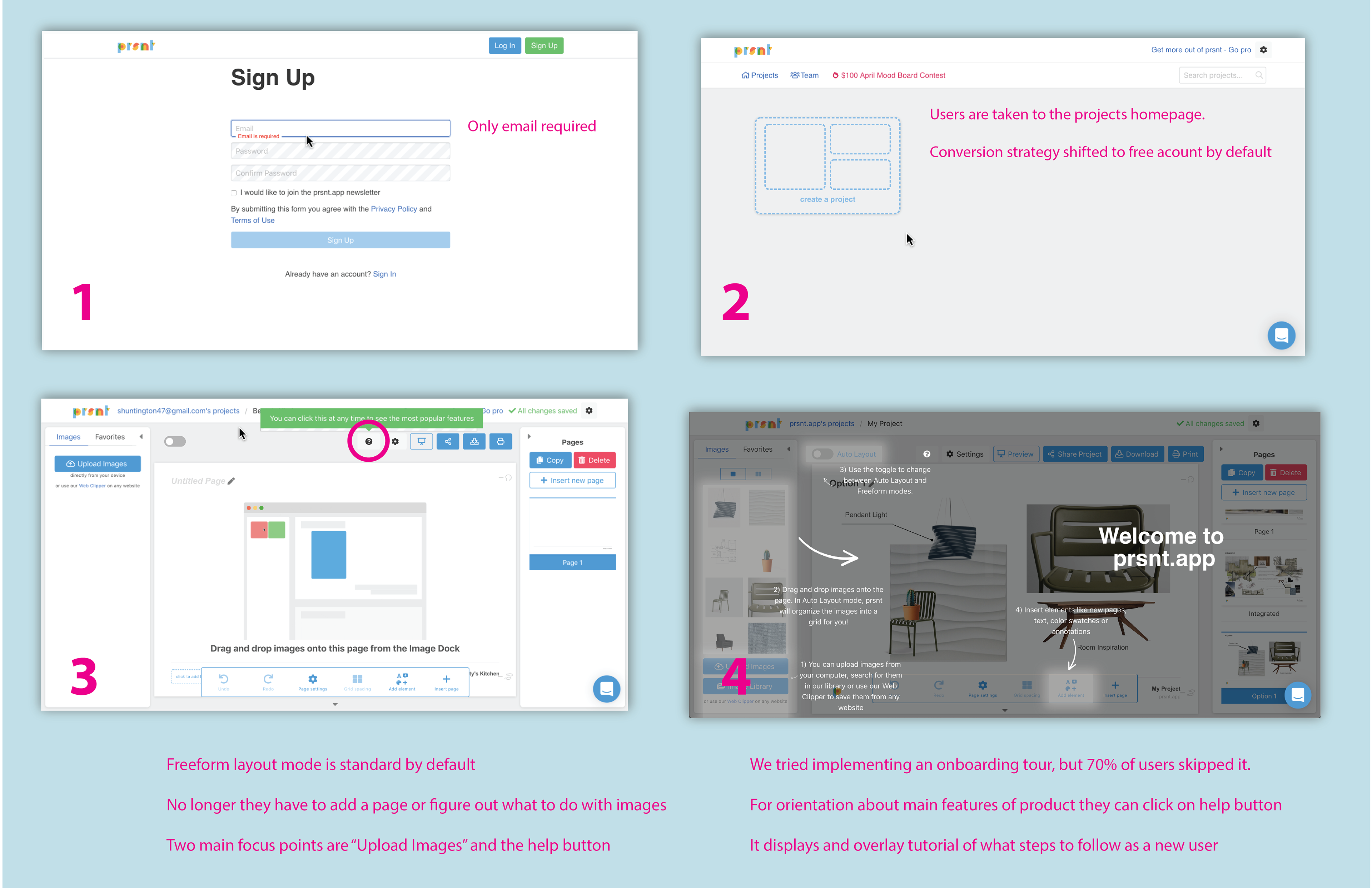
Onboarding Flow
Toolbar & Interface Optimization
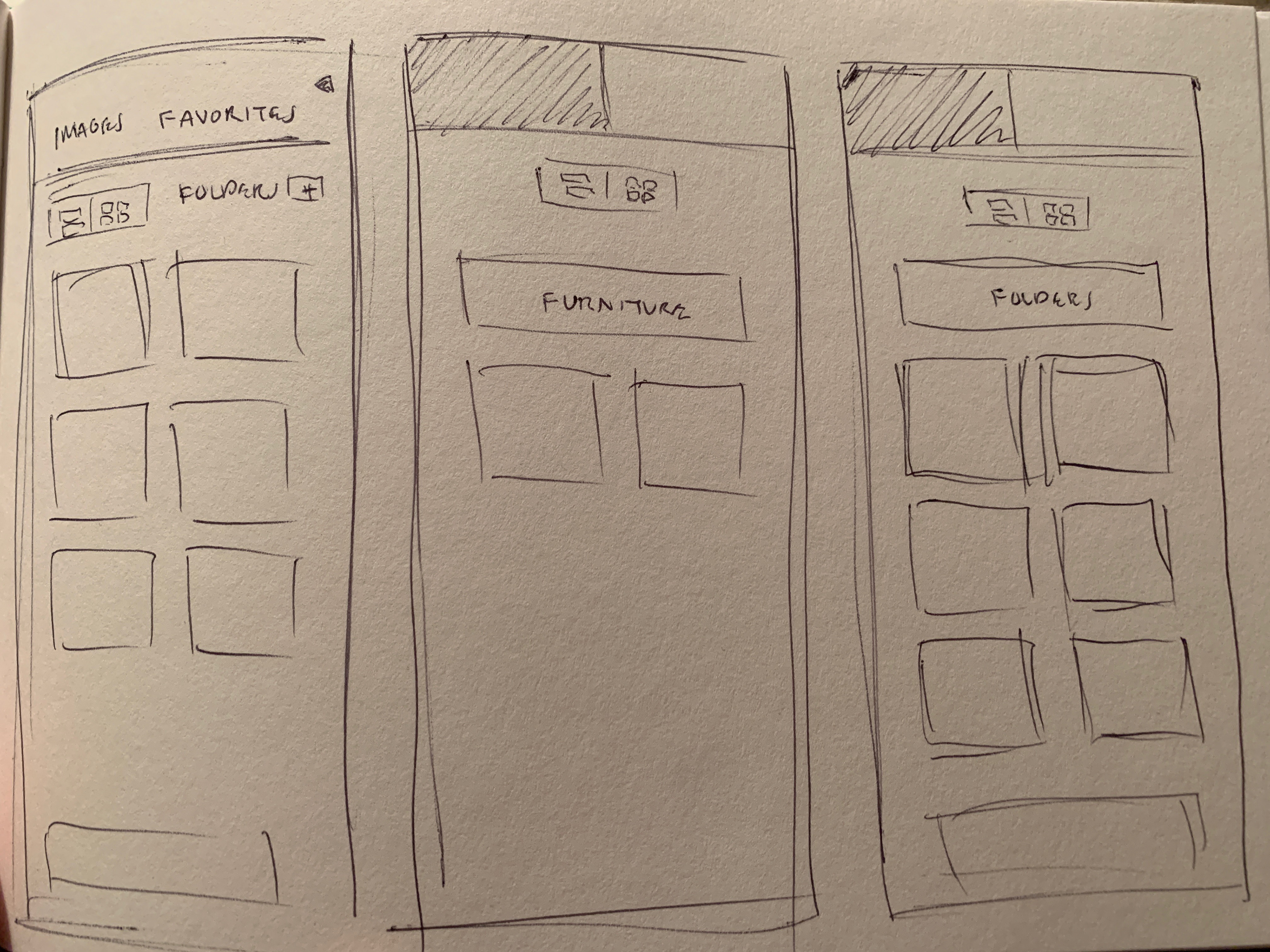
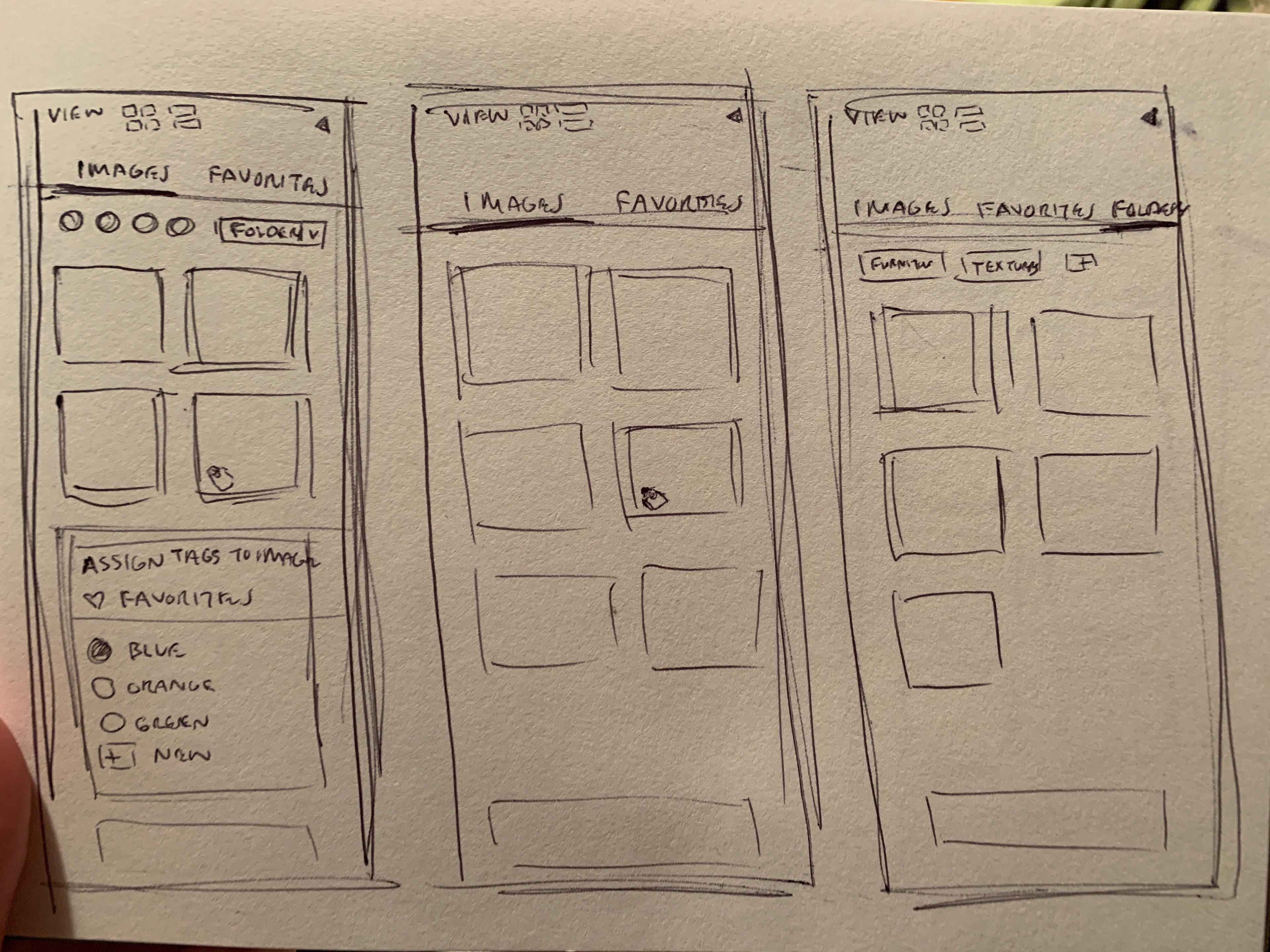
Image Categorization
In many occasions I also collaborated on HTML and CSS coding
Data Analytics
Decisions where never made in a vacuum. With the aid of analytics tool like Heap and Fullstory, we kept a close look on how changes in the product were affecting our metrics. The most important metrics we were always paying attention to where: business goals (conversions) and user goals (engagement). Using industry research as a benchmark, we learned that our metrics regarding paid conversions at 3% were in line with popular products like Dropbox.
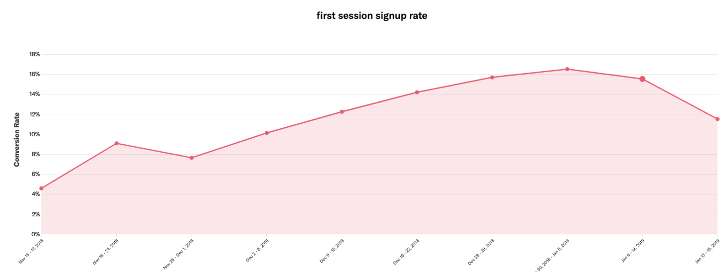
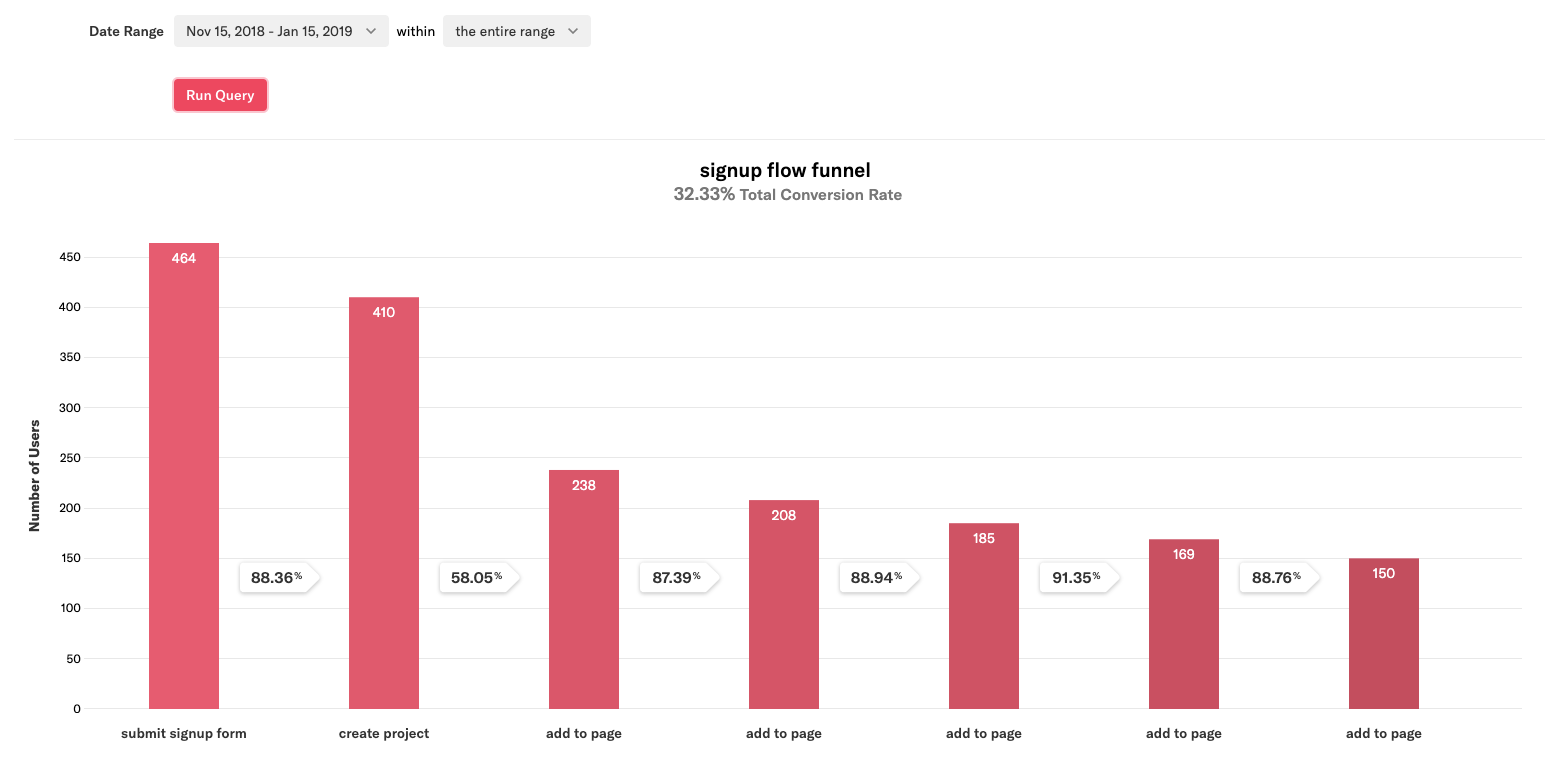
After making changes to our onboarding flow, our first session sign up rate increased by 4% points
Strategy
Product Roadmap Exercise
Insights
- Focus on strategic partnerships to reach target audience. Create a viral campaign.
- Limit functionality for Free plan to increase paid conversions.
- Improve sharing ability to keep target users engaged. Create an onboarding tour for new users.
Efforts to gain traction
Takeaways
What did I learn?
This was a new experience for me in many aspects. I learned about collaboration and work flow with a completely remote team. For keeping communication lines open we used tools like Slack, Hangouts, Jira and more. It was my first instance of acting as the only Product Designer in a team.
In a small team roles are never rigid or set in stone. Team members use their multidisciplinary skills to move the product forward, help solve problems, and in the process learn new ones. My favorite aspect has been all the new skills I had the opportunity to put in practice like Product Management, Business Development, Coordination of a Dev Team.
The most important lesson from this project is that we always have to be challenging our assumptions. Whether they're about users or product-market fit. As humans, things we help create make us have an emotional attachment to it, which is why putting aside egos and letting go is most difficult. But if we can power through and apply our research data, pivoting can be the successful move in the right direction.